Designing digital assets before thinking through your content is a little like placing the proverbial cart before the horse. Instead, leading with the content elements that will drive your user experience—from web copy and blog posts to user videos and architectural photos—and then designing intelligently to make that content shine is the smarter, more seamless approach.
After all, design in the absence of content is similar to building a skyscraper without a plan for the interior. You wouldn’t expect to pull that off on a construction site, and you shouldn’t plan to take that approach with your digital assets either.
Whether consumers want an update on the construction of your latest large-scale warehouse facility or want to learn about your sustainability efforts, a content-focused approach will improve the readability and digestibility of content. Enabling users to easily find and consume relevant information will also deliver a more positive user experience.
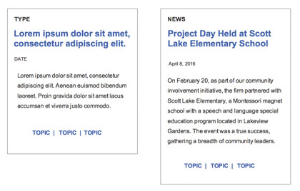
Content-focused design enables designers to anticipate potential issues. For example, unlike general “filler” or “placeholder” content, your real content will likely differ greatly in length, tone, and/or format from one blog post, site section, or campaign to the next.

Wireframe Boxes
Defining the content first and then designing for its unique specifications allows teams to make decisions surrounding a realistic design and prevents costly adjustments to the content and/or design later in the project. Eliminating inadvertent surprises also helps ensure that your final design meets and accentuates all of your content requirements.
Putting content first may seem intuitive, but, surprisingly, it is not standard fare among many marketing and design teams. This approach demands strategic planning and some rigor from everyone involved—from your designers and developers to your content producers and project managers—to ensure that all content decisions are made first. And yet, it is a worthwhile pursuit because content-focused design delivers three key benefits:
Trims design time. Providing designers with real content, instead of general placeholder text (e.g., Lorem Ipsum), allows the design team to make efficient and informed decisions regarding layout, including sizing wireframe boxes for text, captions, and photos. Using filler text first and plugging in real content later may significantly change the website design, and take hours of a designer’s time to accommodate the new text.
Provides a better user experience. Website analytics make it clear which content resonates best with different audience segments and allows construction firms to prioritize how they present that content to their users. Creating an experience that is customized and designed specifically to highlight that content will keep users engaged and wanting more.
Helps to optimize content across devices. Knowing your content and prioritizing its order or hierarchy before you get to the design phase will make it easier to plan a successful transition to mobile, where you have limited real estate to highlight your most important content. Knowing what you must feature, and what’s OK to cut from certain responsive breakpoints, will ensure your key messages are always emphasized, and your users have an optimal experience, regardless of the device they’re using when accessing your content.
MAKING THE MOVE TO CONTENT-FIRST
There is no question that a content-first approach can pay dividends, but its benefits can truly shine when you’re working on larger-scale projects, such as a website redesign.
In this instance, a good first step is to conduct a content inventory or audit. The content audit is a tool for analyzing the current content and determining whether or not it meets both organizational and user objectives. You can also use interviews, analytics, and surveys to gain an overall understanding of the content and discover any gaps or new content to include in the redesign. It’s important to have clarity on the format of any new content and an overall order for the content to appear.
In instances where final copy is not available during the design phase, replace it with rough drafts instead of resorting to generic placeholder text. The rough drafts, called proto-content, can be drafts of the real content, the current website content or competitor content similar in length and style to what you plan to create. This step will help your designers make better decisions and avoid costly design changes later in the process.

Long-form Content
LET YOUR LONGER-FORM CONTENT SHINE
Longer-form content, including executive summaries, long company descriptions, and employee bios, can also pose particular challenges for the design team.
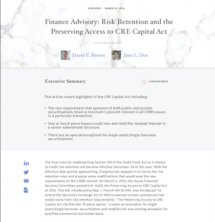
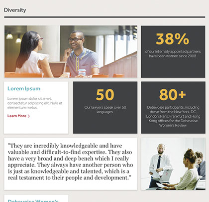
One North recently partnered with a firm to redesign the “Recognitions” page of its website, which showcases its honors, awards, and overall expertise. Although the content the firm provided during the design process was similar to the company’s current “Careers” webpage, it included additional elements such as data points, quotes, and longer-form anecdotes.
Starting with client-approved copy allowed us to design a more digestible executive summary page that featured pull quotes, bullet-point lists, and various images. It also enabled us to accommodate the longer-form content into our design template and save hours of time we would have lost if we had received the longer-form content later in the design process.
DESIGNING WITH CONTENT IN MIND
More construction companies would do well to rethink their timelines and processes and adopt a content-focused design approach to their websites and other marketing materials.
Companies must build or work with dedicated content strategy teams to develop, understand and prioritize content, as well as align content strategy with brand strategy. This will make your digital assets more readable, accessible and usable, and keep your team on budget. ■
About the Authors: Kim LaGesse worked as a user experience strategist at One North Interactive, guiding the user experience planning process in constructing optimal digital experiences for One North clients. Kim’s experience with professional services organizations gave her strategic insights into creating the most effective digital experiences for relationship-based organizations. Kim now focuses her talents at an agency that concentrates on product-focused digital strategy.
Jessica DuVerneay is a user experience strategy manager at One North Interactive and leads her team through discovery, research, information architecture, and user experience processes for clients, supporting a number of Strategists along the way. With nearly 10 years of experience in UX and IA, Jessica empowers clients while mapping solutions in a quest for key insights.
_________________________________________________________________________
Modern Contractor Solutions, May 2017
Did you enjoy this article?
Subscribe to the FREE Digital Edition of Modern Contractor Solutions magazine.

Content-First Approach


